64th edition 5 - 8 April 2027 | Bologna - Italy
64th edition 5 - 8 April 2027 | Bologna - Italy
64th edition 5 - 8 April 2027 | Bologna - Italy
This year, for the forth edition of the “BCBF visual identity workshop”, the design studio Chialab, together with the Fiera team choose the Lithuanian illustrator Rasa Jančiauskaitė from among the artists of the 2019 Illustrators Exhibition.
This is the story of how the Chialab working group guided Rasa towards the creation of what was to be the Bologna Children’s Book Fair visual identity for 2020.
“The “BCBF Visual Identity Workshop” is the design laboratory that for the last four years has developed the Bologna Children’s Book Fair’s image.
The BCBF Visual Identity Workshop is a design process aimed at pulling together illustration, graphic design, typography and wording to create the BCBF’s annual visual identity.
The Design Team
Before describing how the illustrator is chosen and how we developed our plan, let me briefly look at how we bring together graphic design, content, text, figures, colours, typography, graphic interface and codes. Our method is based on teamwork by our Design Team, a group of people with different skillsets all working together towards a common goal that may be adapted or even changed as work develops. In this way, highly specialist disciplines can dialogue despite their different expertise, vocabulary and approach.
This was the method also adopted by the BCBF Visual Identity Workshop.
The Design Team is made up of Beppe Chia, Jessica Cantoni, Alex Weste, Michele Tomasini and Simona Pastore. Elena Pasoli and Deanna Belluti contribute on a daily basis as spokespersons for BCBF.
You’ll never find anything if you don’t know what you’re looking for
The BCBF Visual Identity Workshop starts each year by selecting three illustrators from among those chosen for the Illustrators Exhibition. Before looking at the hundreds of illustrations in the show, we decided on the visual identity features we wanted for the 2020 BCBF, condensing them into four key words: incisive, primordial, monochrome and symbolic.
We scanned the illustrations with these four words in mind looking for three possible candidates. All were reflected in the work of: Rasa Jančiauskaitė (Lithuania), Miyata Takashi (Japan), and Teng Yu (Taiwan).
Seeing means choosing
The three candidates chosen were asked to produce 6 sketches to represent the BCBF as a whole and its five main activities: the Awards, Illustrators Exhibition, Survival Corner, Translators Centre and Digital. We didn’t ask for finish layouts, nor did we reveal the four words that had guided our selection.
Rasa Jančiauskaitė’s proposals continued to resound with the words ‘incisive, primordial, monochrome and symbolic’, clearly indicating the choice we should make. She was “our” artist!
Meeting in order to share
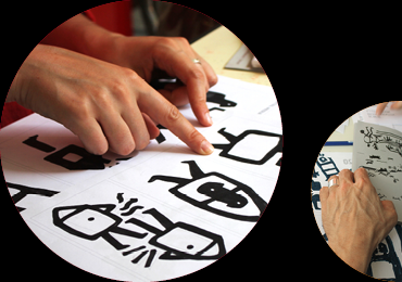
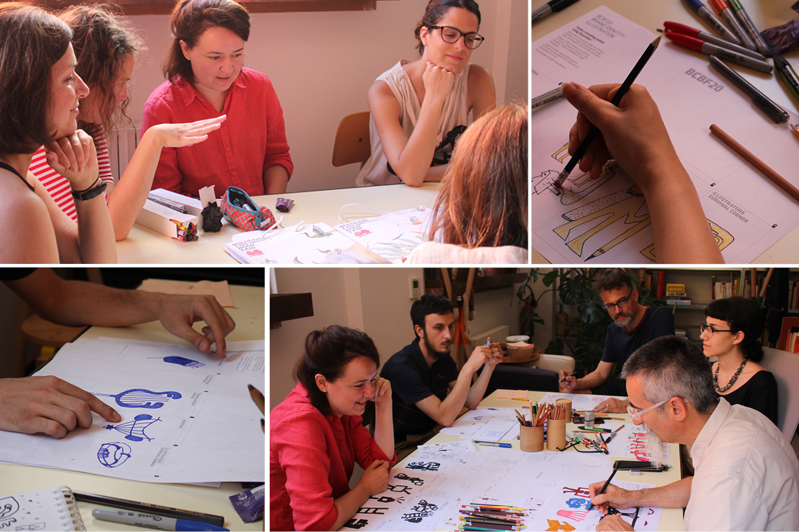
Rasa arrived in Bologna in July after a long journey that took her from Vilnius to Bologna via Lublin and Warsaw. We immediately set up the design team with Rasa, Beppe, Michele, Jessica, Alex and Simi. We all took an active part since everyone had to know how the images to be used in the many different section actually originated – and also to make Rasa feel comfortable about leaving her work in our hands. The first step we took with Rasa was to illustrate the BCBF visual identity guidelines, starting from the origins of the logo through to the last three editions illustrated by Daniele, Chloé and Masha.
Rasa drew with us and we with her. Everyone came up with different ideas. Rasa saw our drawings and got a better idea of the BCBF requirements, and we critiqued her drawings. In the end, the four words – incisive, primordial, monochrome and symbolic - started taking shape in some sketches. Rasa went back home with many ideas and a clear statement to guide her: “Giving life to children’s content”.
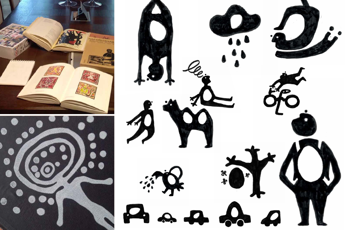
Eggs, the Lascaux caves, Tanum, Val Camonica…
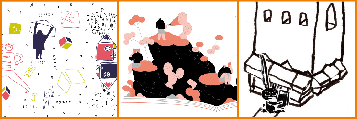
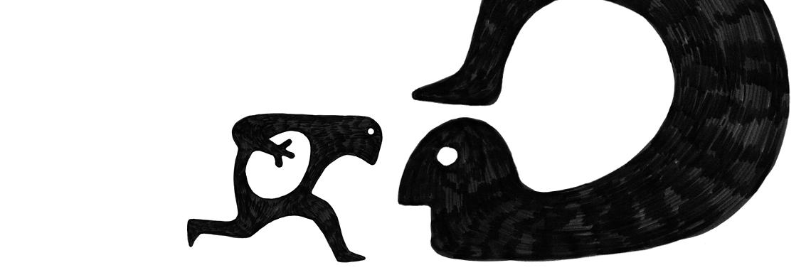
Giving life, shining light, giving birth, incubating and hatching. The egg is a symbol of fertility that must be handled with great delicacy.
This gave rise to the egg-idea – something precious and delicate that everyone brings to the book fair to share with others. Representing it in all its purity required the utmost simplicity. This in turn required going back to the origins of representation itself, to primordial expression and the cave. Rasa did research and her work became incisive, direct, spare in the extreme and without colours. It became drawing in its most primitive form, a form that can give rise to new worlds.
Rasa’s drawings contained all this – along with a delicately ironic touch.
Giving Life to Children’s Content
At the end of the summer, some forty egg-ideas had arrived in our studio: forty black drawings by Rasa that will be the basis for BCBF’s image in 2020. The BCBF is the collector and incubator of ideas to be shared and reproduced.
This marked the end of the first stage in the development by the Design Team of the BCBF visual identity. Now we await the phase of multiplication, dissemination and interpretation. Enjoy!
Beppe Chia (Chialab)